Florida Capital Development Website Refresh

Recently, I was given the opportunity to renovate a website for a tax preparation business, which is owned by my dad. I was eager to do so not only to help a family member, but also because it would be a refresher on my WordPress skills and give me experience working on an actual company’s website. Though I cannot take credit for creating the site or its graphics, I have taken over as the web administrator and have updated it to fit the business’ current focus.
Originally created almost two decades ago, Florida Capital Development’s website has remained in the digital landscape of the 2000s. Using my eye for visual design, I have given the site new colors, typography, images, and other enhancements to bring the site into the modern web of 2026.
Essential Business Updates
- ⯎ Revised the business hours
- ⯎ Changed mentions of multiple employees to just one
- ⯎ Removed services that are no longer offered
- ⯎ Published any pages left as drafts
- ⯎ Removed fax number
Key Aesthetic Improvements
Headings

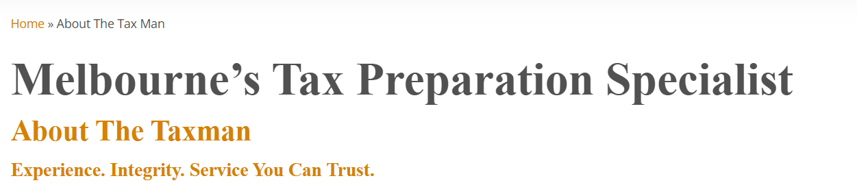
One glaring problem with the heading style was the black stroke around the text. This design choice was made to increase the contrast between the yellow text and the white background, but it didn’t make for an aesthetically pleasing look. Alongside this problem, the text had an odd appearance, which I assumed was just how the typeface was supposed to look. The text had a bizarre splotched appearance, where the stroke seemed to worm into the yellow pixels of each letter. These problems grew worse on mobile, with the stroke becoming thicker and actually posing a readability problem on an already small screen.
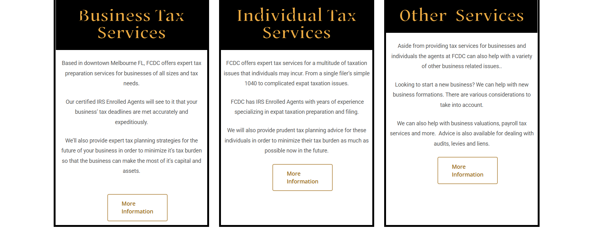
It took me a while to figure out that this wasn’t just a bizarre typeface being used—this was a browser compatibility problem. The combination of the typeface and the stroke were not compatible with the browser, leading to a bizarre splotched appearance where the stroke clipped into the pixels of the letters. After researching the issue, I made the decision to solve these visual problems with two solutions—a new, more sophisticated typeface and a darker text color. These changes made the text convey the nature of the business better and increased the visual clarity of the headings.
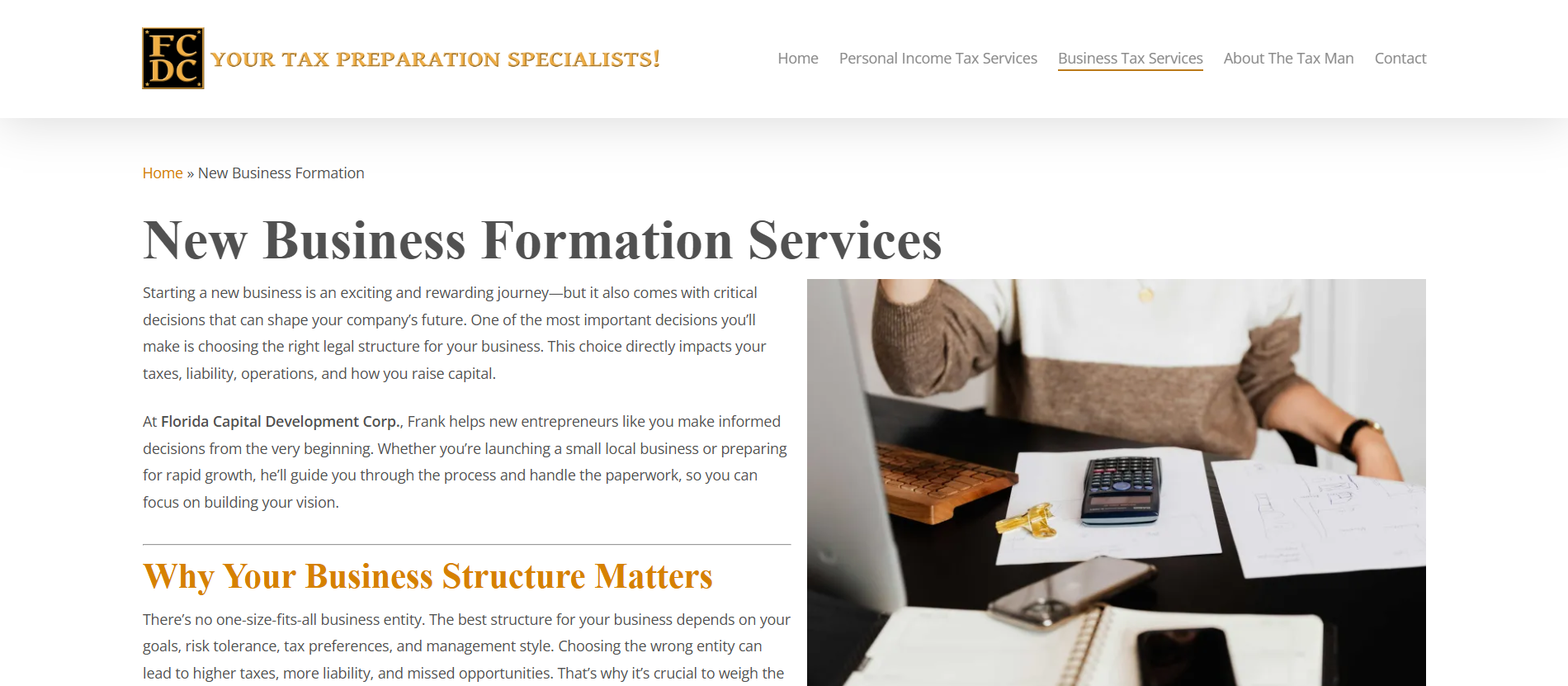
Navigation Menu (Desktop)
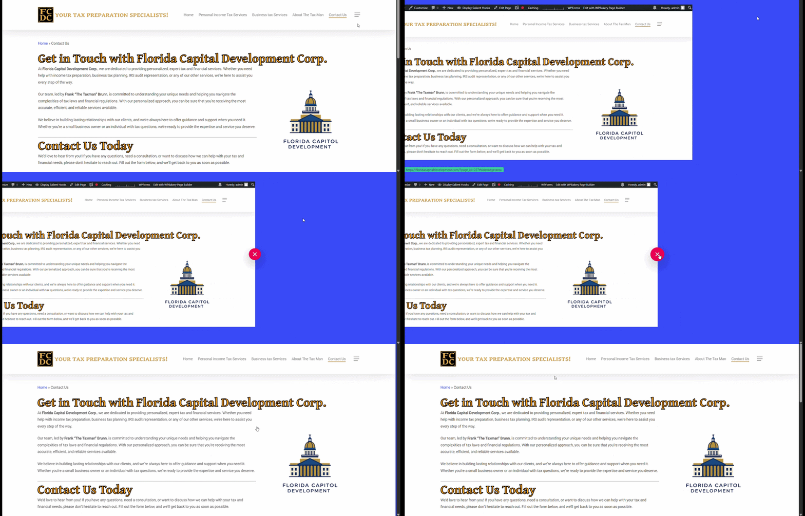
An especially weird quirk to this site was the presence of the mobile menu icon on desktop. Upon clicking it, the site would slide to the left and the visitor would see the blue background of the mobile menu appear from behhind it, with the only button being a red close button.
I ended up finding the culprit of this issue, which was a toggled on option within the Salient Child Theme, called “Off Canvas Menu”. This adds an off canvas menu button to all viewports, so when I turned it off, it made it only appear on mobile. This removed confusing and unnecessary functionality from the desktop version and made it appear more like a typical desktop site.
Navigation Menu (Mobile)
The previous mobile menu had the same awkward sliding animation as the desktop, only this time, menu options could actually appear in front of the blue background. Since the color was pretty jarring and didn’t match the rest of the site’s color scheme, I changed it to a dark shade of amber. I used the background blur option and chose a smoother animation as well.
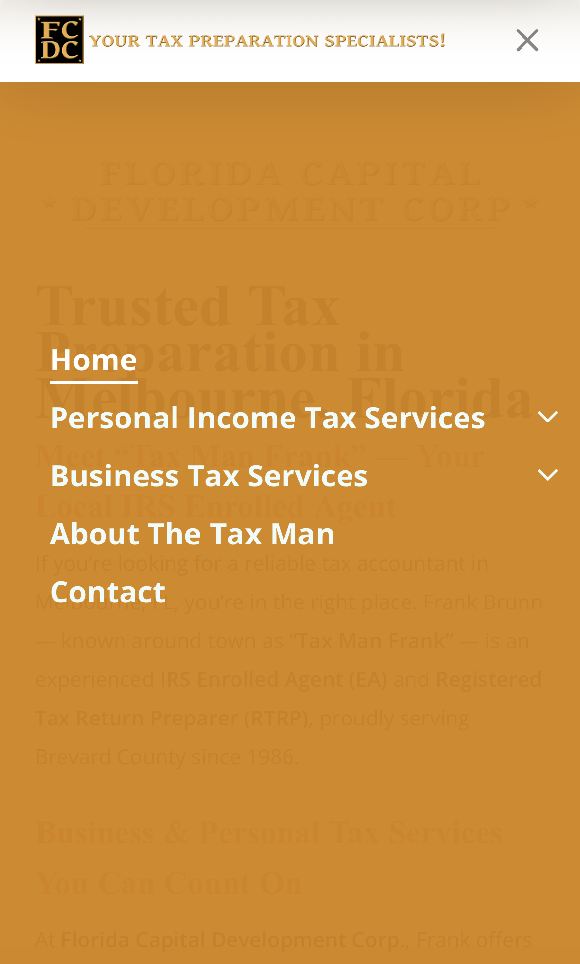
In line with the mobile menu icon is the header, which contains the site’s tagline. Its appearance is fine on desktop, but on mobile, the text overflowed into the menu icon and off the viewport. I was able to decrease the text size so that it fits in the header and is still readable.
New Images
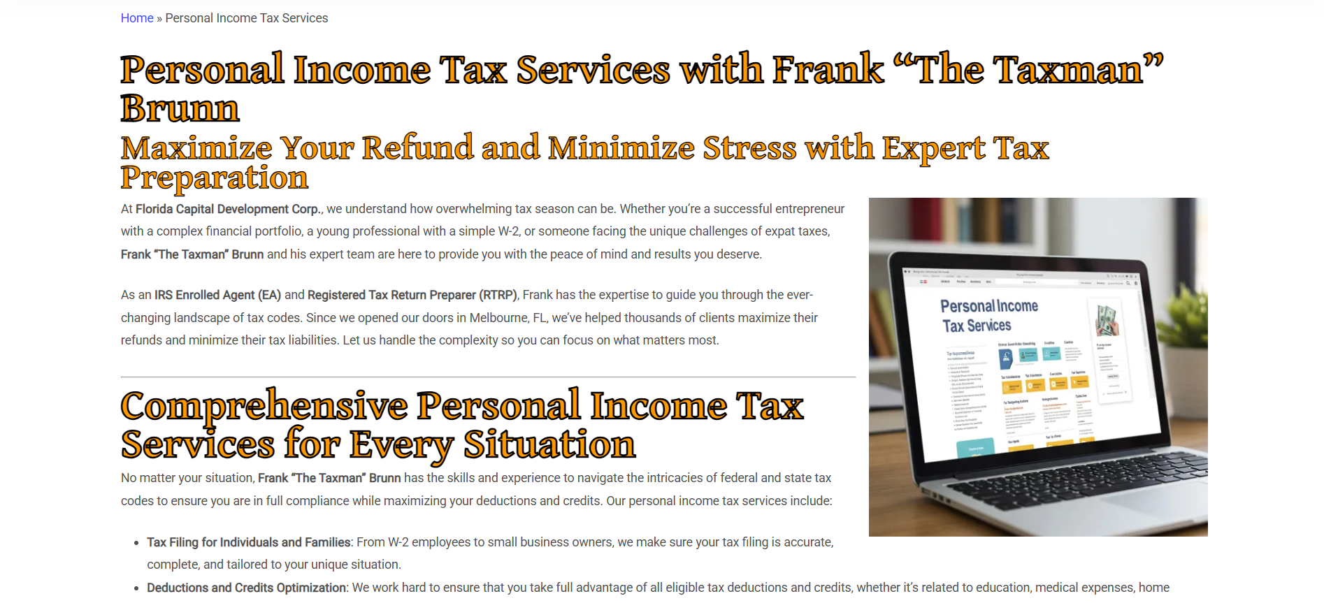
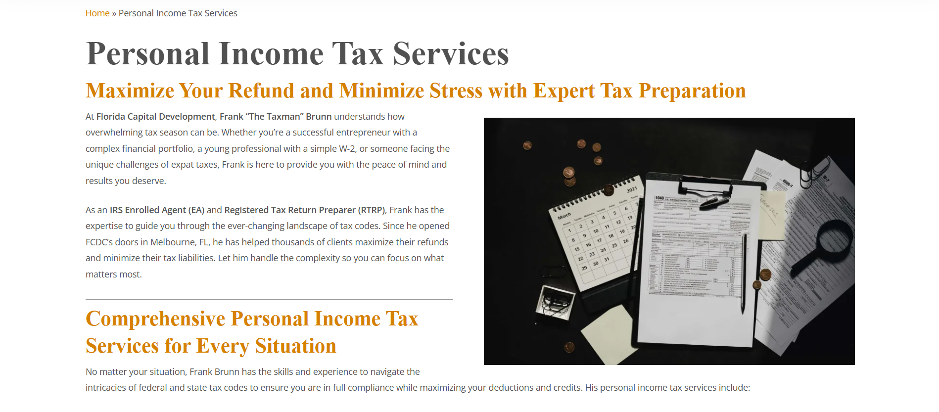
Some images on the site were AI-generated and had offputting appearances. A lot of the text in these images was gibberish, and any real images used were low quality. I replaced all of these with copyright-free images from a website called Pexels.
On the “About” page, the image used was a very dated family photo that included several pets (who have long passed) and very young versions of my siblings and I. The new image I chose is a recent photo of my dad with my mom. The site renovations wouldn’t be complete without this new image to reflect what my dad looks like now.
Important Accessibility Updates
The heading order on the site had not been enforced, with some pages having no H1, some heading levels being skipped, etc. I fixed this pretty easily with WordPress’ WYSIWYG editors. An especially interesting case within this problem was how the home page was handled. The creator of the site used an image of text in place of actual text for an H1. This individual was not a web-oriented person, so I don’t blame them for thinking that this was an okay feature to implement. Due to its size, it almost serves as a hero section, and the beveled effect on the words provides great visual interest to the home page. Not wanting to ruin this look, I kept it and inserted an invisible H1 under it so that it can be read by screen readers and search engines while not making the copy text redundant.
Final Touches & Conclusion
Along with the improvements already mentioned, I worked closely with the owner (my dad) to change some of the uncharacteristic segments of copy. Now that the site reads and looks more like his business, I'm satisfied with my work. It was a big learning opportunity for me, and it really helped me learn more about WordPress as a follow-up to the internship where I first used it. Ill continue to serve as Florida Capital Development’s web administrator and provide any other updates needed in the future.